
Date:
August 19, 2026
 Web Development
Spend enough time browsing contemporary websites and a peculiar sense of familiarity begins to develop. It is particularly noticeable among technology companies, digital agencies, SaaS products and startups, although the pattern extends well beyond those sectors. Large sans-serif headlines dominate the opening screen, navigation has been reduced to a handful of items, buttons have become rounded capsules, and content is organized into alternating blocks of text, screenshots, cards and testimonials. Gradients, oversized typography and carefully controlled whitespace provide differentiation at the surface, but beneath them sits an increasingly recognizable structural language.
This perception is not entirely subjective. In 2021, researchers from Indiana University presented one of the more systematic attempts to determine whether the web had actually become more visually homogeneous. Using computer-vision techniques on historical screenshots of websites between 2003 and 2019, they found that website designs had become significantly more similar since 2007. The effect was particularly pronounced in page layout, where the average visual distance between sites decreased by more than 30 percent. Interviews with experienced web designers pointed toward several overlapping explanations, including greater reuse of libraries and source code, increasing standardization of color schemes and the structural requirements introduced by mobile devices. (Web History)
The interesting part of this finding is not that designers have become less creative. There is little evidence for such a simple explanation, and the technological capabilities available to contemporary designers are considerably greater than they were fifteen or twenty years ago. Modern CSS provides sophisticated grid systems, container queries, variable fonts, complex animation and responsive behavior that would once have required extensive JavaScript or been practically impossible. Browsers are faster and more consistent, design software is more capable, and the distance between a visual concept and a functioning interface has decreased dramatically.
Web design has nevertheless converged because the environment in which websites are produced has changed. Responsive design, standardized interaction patterns, design systems, reusable components, templates, conversion optimization and increasingly artificial intelligence all encourage designers toward solutions that are already known to work. None of these developments is inherently negative. Most emerged because they solved genuine technical or usability problems. Their combined effect, however, has been to reduce the range of decisions that need to be made independently on each project.
The modern web therefore presents an unusual contradiction. We have more technical freedom than at any previous point in its history, while much of what we produce occupies an increasingly narrow visual range.
Early websites were extraordinarily diverse partly because web design had not yet developed a stable professional vocabulary. During the 1990s and early 2000s, designers were working with limited layout tools, inconsistent browser implementations and few established conventions regarding how information should be presented online. Frames, image maps, tiled backgrounds, animated GIFs, Flash introductions, graphical navigation systems and unconventional page structures appeared alongside one another because there was no widely accepted model of what a website ought to be.
It would be a mistake to romanticize this period. Many early websites were difficult to navigate, inaccessible, slow and visually chaotic. Basic operations that now require almost no conscious thought could demand considerable interpretation from the visitor. Designers were also constrained by technologies that were never intended to support sophisticated visual layout. HTML tables became design tools because CSS had not yet developed sufficiently, while typography was restricted by the small collection of fonts designers could reasonably expect to exist on a visitor’s computer.
What the period did possess was a remarkable degree of visual variation. Websites belonging to newspapers, universities, musicians, technology companies and private individuals often looked as though they came from entirely different media. Part of this reflected the absence of standards, but part also resulted from the fact that designers had fewer ready-made solutions available. Decisions that would now be inherited from a framework, component library or template had to be solved within the individual project.
Research into the historical development of web aesthetics supports the idea that identifiable design periods emerged as the medium matured. A 2017 CHI study examining prominent websites over long periods proposed a series of broader aesthetic phases in the evolution of web design, reflecting changes not only in visual taste but also in the technologies and professional practices surrounding website production. (DOI) This is significant because the visual history of the web cannot be separated cleanly from its technical history. CSS, broadband, smartphones, web fonts, JavaScript frameworks and high-density displays did not merely allow designers to implement existing ideas more efficiently. Each changed which kinds of design were practical.
The maturation of the medium gradually established a shared grammar. Visitors learned where navigation was likely to appear, how links behaved, what a button looked like and where they could expect to find common information. Designers learned that these conventions reduced the amount of interpretation required from users. Once a pattern became sufficiently familiar, departing from it required a reason.
This process is normal in design. Books, newspapers, road signs and operating systems all rely on conventions because communication becomes inefficient if every artifact invents its own language. The important question is therefore not why web design developed conventions, but why those conventions eventually began influencing areas where standardization was not functionally necessary.
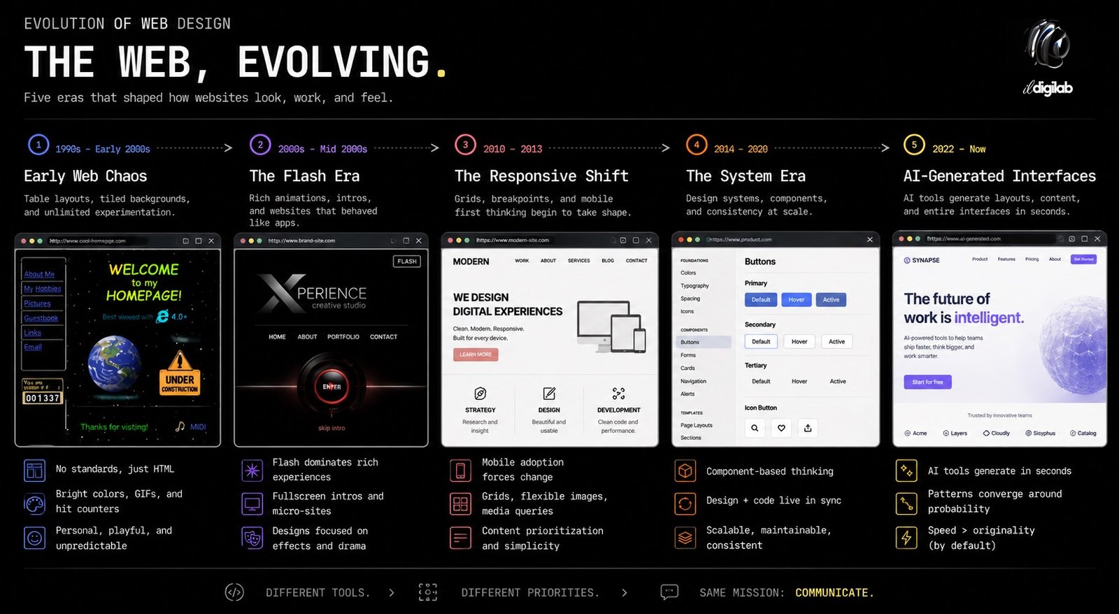
The arrival of the smartphone is probably one of the most important events in this history. Before mobile browsing became dominant, websites could be designed around relatively predictable desktop dimensions. There were still variations in monitor resolution, but designers generally worked within a horizontal environment that allowed navigation, sidebars and content to coexist.
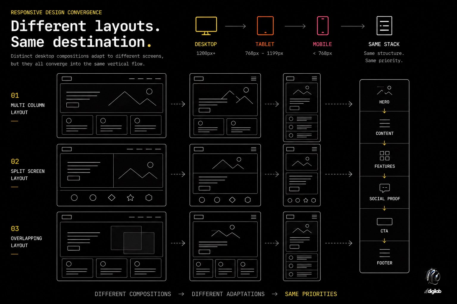
Responsive design changed the problem fundamentally. A single information architecture now had to operate across screens with radically different proportions. Content designed for a 1440-pixel desktop might eventually need to function on a device little more than 300 pixels wide. The same website also had to accommodate intermediate tablet sizes, orientation changes, browser zoom and eventually an enormous variety of devices.
The design response was rational: layouts became modular.
Columns could collapse vertically. Navigation could condense into a menu. Images could resize relative to their containers. Sections could be designed as independent units that rearranged themselves at different breakpoints. The visual language that eventually emerged from responsive design was not simply fashionable; it was technically robust.
Cards became particularly effective because they encapsulated information in a structure that could be moved without substantially changing its meaning. A four-column collection of cards on desktop could become two columns on a tablet and a single vertical sequence on a phone. The same principle encouraged horizontally arranged content sections that could stack vertically when space became limited. Many of the patterns that now make websites appear similar are therefore successful adaptations to the physical diversity of modern computing devices.
The relationship between globalization and visual convergence is visible in research as well. A study of 80,901 website designs across 44 countries found substantial differences between local web cultures in properties such as colorfulness, saturation, visual complexity and the amount of text displayed. At the same time, websites operating globally were more homogeneous across countries than local websites. (Illinois Experts) The finding suggests that design convergence is partly an adaptation to scale. The more environments, audiences and devices a website must support, the more attractive broadly understood conventions become.
Responsive design did not make originality impossible, but it increased its cost. An unconventional desktop composition is relatively easy to conceive; deciding how the same composition should behave across dozens of possible viewport sizes is a more demanding engineering problem. Standard patterns already contain answers to those questions, which gives them a practical advantage before aesthetic considerations even begin.
A second transformation occurred as digital products became larger and more complex. Designing individual pages independently became increasingly difficult to maintain, particularly for applications involving hundreds or thousands of screens. The industry responded with design systems, component libraries and standardized visual primitives.
This was another major improvement in professional practice. A mature design system establishes rules for typography, spacing, color, buttons, form controls, cards, navigation and other recurring interface elements. Developers can reuse tested components rather than rebuilding them repeatedly, while designers gain consistency across products and teams. Accessibility problems can be corrected centrally, and modifications to the visual system can propagate throughout an application.
For software products, the logic is difficult to dispute. Users benefit when the same control behaves consistently throughout an interface, and organizations benefit when teams share a common implementation language.
The difficulty arises when a methodology developed partly to manage large software systems becomes the default methodology for almost every type of website. Marketing websites, portfolios, editorial projects and cultural institutions do not necessarily have the same requirements as enterprise applications, yet they increasingly inherit the same component-based logic.
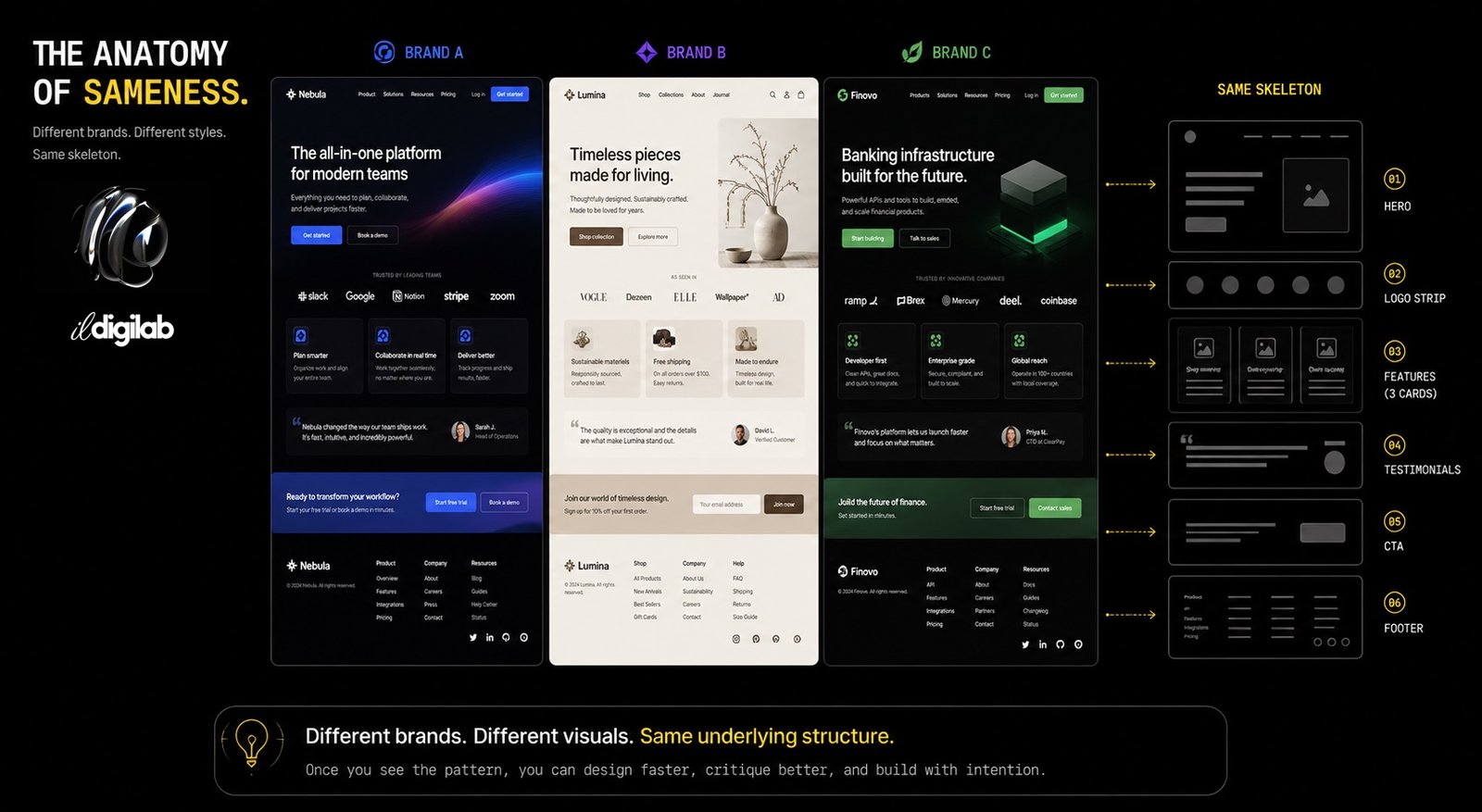
This influences design at a more fundamental level than simply making buttons look similar. Once the designer begins thinking primarily in components, information itself tends to be organized into units that fit those components. Three benefits naturally become three cards. Client logos become a logo strip. Testimonials become another horizontally repeating component. Frequently asked questions become an accordion because an accordion already exists in the system.
The architecture begins shaping the content.
This is one reason contemporary websites can appear similar even when they use completely different fonts, colors and imagery. Their decorative layer changes while their structural logic remains largely identical.
There is nothing intrinsically wrong with this approach. Reusable systems make websites easier to build, maintain and expand. The problem appears when the efficiency of reuse becomes more important than determining whether the reused structure is appropriate to the information being communicated.
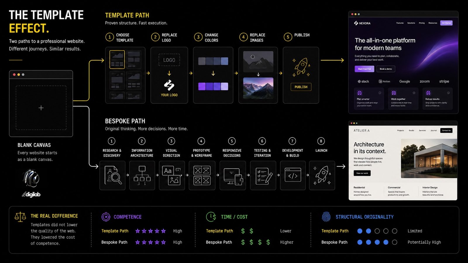
Templates are frequently blamed for making the web generic, but this criticism ignores how much they improved the lower end of the market. WordPress themes, Elementor kits, Webflow templates, Shopify themes and similar products have given small organizations access to design quality that would once have required significantly larger budgets. Responsive layouts, coherent typography, professionally designed navigation and sophisticated interaction patterns can now be deployed rapidly and inexpensively.
The result is that obviously amateur commercial websites have become less common. A small restaurant, independent consultant or new business can begin with a competent visual system rather than an empty document. This represents genuine progress. The minimum acceptable standard of web design has risen considerably.
Templates nevertheless change the economics of originality. A conventional layout has already been designed, tested and made responsive. Departing from it requires additional design decisions, development time and testing. Every unusual composition must eventually answer practical questions about mobile behavior, accessibility, content management, localization and browser compatibility.
For many projects, there is no economic incentive to assume those costs. A company that needs a functional brochure website may rationally choose a proven structure and invest its limited budget elsewhere. Homogeneity in this context is not necessarily evidence of poor design; it can be the predictable result of constrained resources.
The effect becomes more interesting higher in the market, where organizations with sufficient resources still frequently reproduce the same structures. At that point, templates are no longer the complete explanation. Instead, the template has become conceptual. Designers who are not literally using the same template may nevertheless be working from the same assumptions about what a contemporary website should contain and how those elements should be arranged.
This is why replacing a WordPress theme with a bespoke Figma design does not automatically produce originality. A custom design can reproduce the same visual conventions with considerably more expensive code.
Commercial web design is not evaluated exclusively as visual communication. It is increasingly treated as an optimization problem in which design decisions are expected to produce measurable outcomes such as purchases, registrations, enquiries or subscriptions.
This has improved web design in important ways. Decisions that were once based entirely on aesthetic preference can now be evaluated against actual user behavior. Poor navigation, confusing forms and unnecessary friction can be identified rather than defended as creative choices.
However, optimization naturally favors patterns that have already demonstrated acceptable performance. A familiar checkout process carries less commercial risk than an experimental one. A visible call-to-action button is easier to justify than an unconventional interaction that requires discovery. Once a pattern becomes associated with successful conversion, it tends to propagate.
There is empirical justification for some of this caution. Research presented at CHI 2020 found that greater visual complexity negatively affected both search efficiency and information recall, although individual visual preferences influenced the strength of the effect. (DOI) Simplicity can therefore provide measurable usability benefits, particularly when visitors need to locate information efficiently.
The problem is not simplicity itself. Simplicity and sameness are different properties. A page can be visually restrained while possessing a highly distinctive typographic system, composition or editorial character. Conversely, a visually elaborate website can be completely derivative.
What optimization tends to do is reduce tolerance for unexplained variation. Every unconventional element introduces uncertainty, and commercial organizations generally prefer predictable performance. Over time, those individual risk-management decisions accumulate into an industry-wide visual tendency.
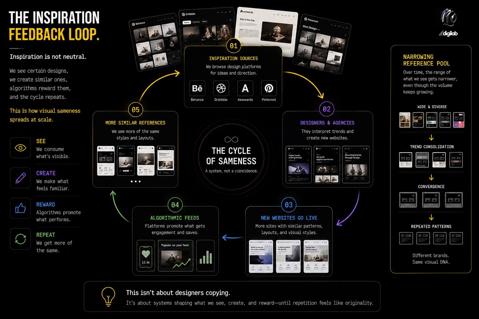
Another influence appears much earlier in the design process, before a component or line of code has been created. Designers increasingly discover references through highly concentrated digital environments: award galleries, Behance, Dribbble, Pinterest, design newsletters, template marketplaces and algorithmically curated social feeds.
These platforms provide extraordinary access to contemporary work, but they also influence what becomes visible. Designs that perform well within a particular aesthetic culture receive more attention, which makes them more likely to become references for subsequent projects. Designers can browse hundreds of examples while unknowingly exploring a relatively narrow visual territory.
The effect resembles a feedback system. A particular aesthetic becomes popular, popular work becomes more visible, visible work becomes inspiration, and inspired work increases the prevalence of the original aesthetic.
This process helps explain why particular combinations can spread extraordinarily quickly. A typeface, color treatment, animation technique or layout appears on several influential websites and within months becomes recognizable across an entire category of digital products. The mechanism does not require direct copying. Designers exposed to similar reference environments can independently arrive at similar decisions because their conception of what constitutes contemporary design has been shaped by the same material.
The phenomenon is particularly visible in startup design, where visual trends can become strongly associated with entire industries. Fintech, artificial intelligence, cryptocurrency and SaaS products have each developed recognizable visual conventions. These conventions help communicate category membership, but they also make individual brands more difficult to distinguish.
Generative AI is often presented as the next cause of design homogenization, but chronologically it arrived quite late. The web had already become substantially more homogeneous before current generative systems existed. The Indiana University research detected the trend across data ending in 2019, several years before generative interface tools became widely available. (Web History)
AI should therefore be understood as a potential accelerator rather than the original cause.
Current generative interface systems typically begin with a natural-language description. A user asks for a modern landing page, a premium portfolio, a minimalist application dashboard or a technology startup homepage. The model must translate subjective adjectives such as “modern” or “premium” into concrete visual properties. It does so using patterns represented in its training and the conventions reinforced through subsequent model development.
The result can be technically impressive while remaining statistically conservative. Large typography, restrained palettes, rounded containers, cards, familiar navigation and predictable content hierarchy are safe interpretations because they already occur frequently in contemporary design.
Recent HCI research into generative user interfaces is beginning to examine whether prompt-driven generation is even the correct interaction model for early design exploration. A 2026 study comparing conventional unstructured prompting with a more structured, breadth-first approach found that the latter exposed designers to a wider range of possibilities, although participants also valued the speed and high fidelity of conventional generative workflows. (arXiv) The tension is revealing. The characteristics that make generative design attractive, particularly speed and immediate polish, may also encourage premature commitment to the first plausible solution.
This is a familiar problem in design methodology. Early exploration is usually most productive when multiple structurally different possibilities are considered before visual details are finalized. Generative systems can reverse that sequence by producing a highly polished interface almost immediately. Once an idea looks finished, rejecting its underlying assumptions becomes psychologically and economically harder.
AI therefore introduces a new form of default. Instead of selecting a template from a marketplace, the user can generate one dynamically. The visual result may be unique at the pixel level while remaining conventional at the structural level.
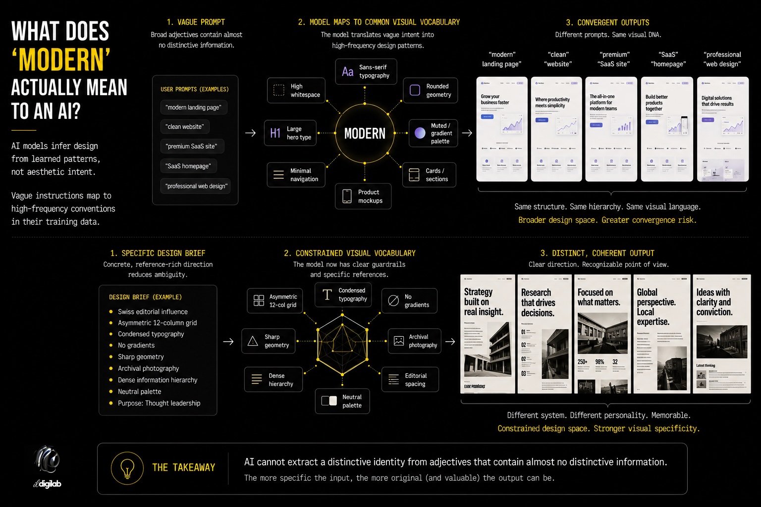
The language used to describe websites deserves more scrutiny. Clients routinely request interfaces that are modern, clean, premium, intuitive or innovative. These words appear descriptive, but they contain very little information about the organization itself.
A design system cannot derive a distinctive identity from generic adjectives. When a human designer receives such a brief, they normally gather additional context through research, interviews, competitive analysis and visual exploration. When a generative system receives the same instruction without sufficient constraints, it must infer the most probable visual interpretation.
This makes generic language a mechanism for producing generic design. The problem becomes particularly visible with AI because the generation happens so quickly, but the underlying issue predates AI. Search a template marketplace for “modern agency” or browse inspiration tagged “minimal startup” and the same semantic compression occurs. Thousands of different organizations are reduced to a small vocabulary of aesthetic categories.
A more useful design brief describes relationships rather than styles. It explains how an organization differs from competitors, what cultural references are appropriate, which visual qualities should be avoided, how information should feel, what degree of formality is required and which existing brand elements have meaning. These constraints reduce the solution space, but paradoxically they can produce more original work because the design is being generated from specific information rather than generic taste.
AI may make this distinction considerably more important. As implementation becomes easier, the quality of the initial constraints will increasingly determine whether the result possesses any identity.
A discussion of homogenization can easily become an argument for novelty, which would be equally problematic. Users benefit enormously from conventions. Nobody wants an ecommerce website to invent a completely new mechanism for adding an item to a basket simply to demonstrate originality. Form fields should remain recognizable, keyboard navigation should behave predictably, and accessibility should not be sacrificed to aesthetic experimentation. The objective of design is not to maximize difference.
Research on cross-cultural website design also demonstrates why universal assumptions should be treated cautiously. The study of more than 80,000 websites across 44 countries found meaningful differences in visual characteristics between countries, indicating that user expectations are not completely uniform. (Illinois Experts) A design that appears comfortably familiar in one context may not produce the same response elsewhere.
The useful distinction is between functional convention and expressive conformity. Functional conventions reduce the cognitive work required to operate an interface. Expressive conformity occurs when visual decisions that do not need to be standardized nevertheless converge because designers inherit the same defaults.
A navigation system can be familiar without the entire website resembling its competitors. A button can behave conventionally while typography, imagery, composition and editorial structure remain distinctive. The strongest designs generally do not reject convention wholesale; they determine where familiarity is useful and where specificity creates value.
This is where the discussion becomes economically interesting.
For much of the web’s history, simply producing a polished website required substantial expertise. Responsive implementation, typography, animation, browser compatibility and content management represented meaningful technical barriers. Templates and no-code systems reduced those barriers considerably, and generative AI is reducing them further.
A visually competent website is becoming a commodity.
That does not mean professional designers are becoming unnecessary. It means the portion of their work that derives value purely from execution is becoming less scarce. If an AI system can generate a reasonable responsive interface in minutes, producing a reasonable responsive interface can no longer justify the same premium it once did. The scarce resource moves elsewhere…
Research, judgment, information architecture, cultural interpretation, brand specificity and the ability to recognize when a conventional solution is inappropriate become relatively more valuable. These are areas in which the designer is not merely producing an interface but determining what kind of interface should exist.
This may eventually change how professional web design is sold. The industry has traditionally priced much of its work around production: number of pages, templates, development hours and functional requirements. As production becomes increasingly automated, strategic and interpretive decisions may account for a larger proportion of the actual value.
The paradox is that AI could therefore increase the importance of human taste at exactly the moment when it reduces the amount of human labor required to construct a website.
There is no technological reason the web must continue becoming visually homogeneous.
Modern browsers provide designers with capabilities far beyond those available during the period in which many current conventions were established. CSS Grid allows compositions that would have been extremely difficult with earlier layout systems. Variable fonts make sophisticated typographic behavior practical without loading dozens of separate font files. Container queries allow components to respond to their actual context rather than simply to the viewport. Modern animation APIs, WebGL and increasingly powerful hardware permit interaction and visual systems that were once restricted to experimental websites.
Generative tools could expand this possibility space further. Research on AI-assisted interface design already describes generative UI as a collaborative and iterative process rather than merely automated production, with emerging workflows involving hybrid creation, curation and AI-assisted refinement. (arXiv) Used in this way, AI could allow designers to test unconventional ideas cheaply instead of pushing them toward the most probable solution.
The outcome depends largely on where these tools are inserted into the design process. If AI is primarily used to generate a finished-looking website from a short generic prompt, it is likely to reinforce existing conventions. If it is used to explore twenty different information architectures, investigate unusual typographic systems, prototype interactions or rapidly test ideas that would otherwise be too expensive to develop, it could have the opposite effect.
This distinction matters because the economics of experimentation have historically constrained web design. Unusual ideas are expensive to prototype when each requires substantial design and development work. If AI reduces that cost, organizations may become more willing to explore alternatives before committing to a familiar solution.
The same technology capable of industrializing generic design could therefore make bespoke experimentation more affordable.
Perhaps the web does not need more unusual websites as much as it needs more specific ones.
Originality is often confused with visual novelty. A site can use unconventional animation, extreme typography and experimental navigation while saying almost nothing particular about the organization it represents. Once those techniques become fashionable, the supposedly experimental website becomes another template.
Specificity is more difficult to imitate because it originates outside the design industry.
A website for an architecture practice might derive its grid from the proportions used in the firm’s buildings. A cultural institution might allow its archive to determine the interface rather than placing the archive into a generic card system. A technology company might expose aspects of its underlying product behavior as part of the visual language. A local organization might incorporate visual references that make sense within its particular cultural environment rather than adopting the international aesthetic of its industry.
These decisions do not require users to relearn how websites work. They simply allow the organization to influence the interface more strongly than the interface conventions influence the organization.
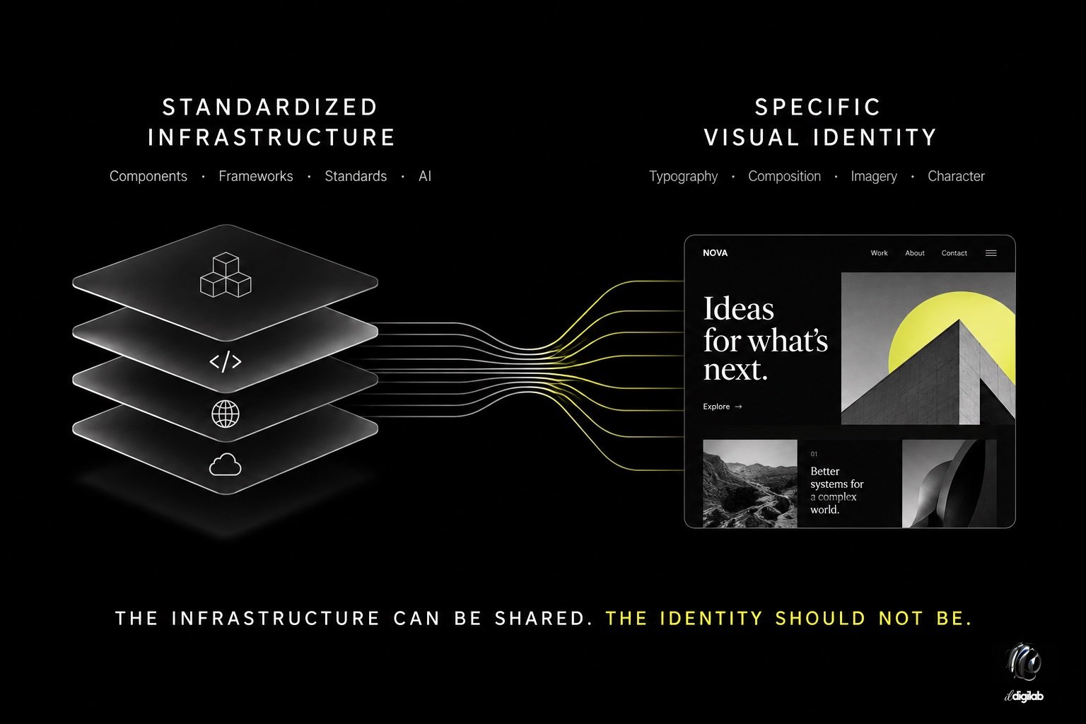
This may be the most useful response to homogenization. Designers do not need to abandon systems, templates, accessibility standards or familiar interaction patterns. They need to become more selective about which decisions should be standardized and which should remain specific to the project.
The web became more homogeneous for understandable reasons. Responsive design solved the problem of unpredictable screens. Design systems solved the problem of maintaining complex products. Templates reduced the cost of professional implementation. Optimization improved usability and commercial performance. Shared inspiration accelerated professional learning. AI is now making competent execution dramatically faster. Each development produced genuine benefits, and reversing them would make little sense.
What deserves reconsideration is the cumulative effect. When every stage of the process provides a reasonable default, from the initial reference search to the component library and finally the AI-generated implementation, it becomes possible to complete an entire website without making many genuinely project-specific design decisions. The result may be polished, usable and technically excellent while remaining almost culturally anonymous.
The future of web design is therefore unlikely to depend on discovering another visual trend. It may depend on recovering a distinction that mature design systems tend to obscure: the difference between decisions that should be inherited and decisions that should be made.
As building websites becomes easier, making those decisions well may become the most difficult part of the profession as the infrastructure of the web can increasingly be standardized; the responsibility of design is to decide what should remain specific.